Testerloop
The missing piece in your testing pipeline.
Summary
Brand foundations, product design and a marketing site for Testerloop, a debugging tool that shows developers and testers exactly why their automated test pipelines fail.
Client
Overloop
The Oppertunity
Testerloop began as a new sub-team within Overloop, an established web engineering consultancy. Developers were debugging automated test pipelines by hand, and QA testers had no access or context to understand the test results. The product and brand needed to feel intuitive to both audiences, without losing the technical edge developers trust their tools for.
No items found.
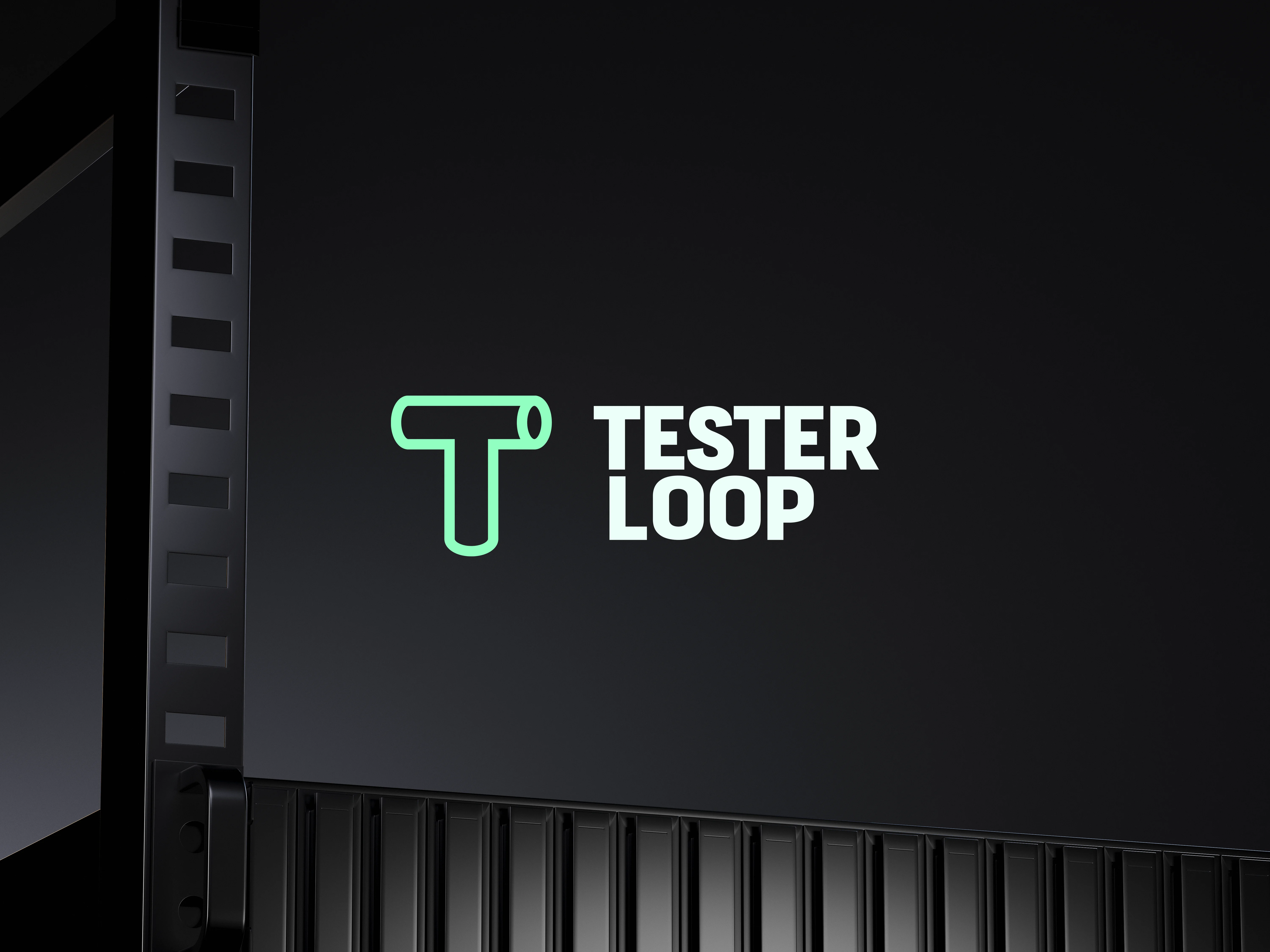
The process started with symbolism. Testerloop's role in a developer's pipeline is the connector, so we built the mark around that role: a strong letterform T combined with the silhouette of a tee pipe fitting. The result is functional and recognisable, doing its job at a glance.
The wordmark is condensed and bold, picked for its authority at small sizes, where the brand most often appears inside the product. We tightened the spacing and refined the letterforms so the type holds its weight in inline labels and run summaries.
No items found.
Ahmed's work was quick and awesome! He understood the brief very quickly, worked well with the product manager and the extended team and produced great design within time and budget. Always a pleasure to work with
Remco Van Stiphout
Founder & CEO
The solution
Working closely with the Testerloop team through collaborative workshops, we shaped a brand, product and marketing site for an engineering audience. The tool went on to pilot with Sony Music Entertainment's engineering team, and Testerloop, together with Overloop, was later acquired by DataArt.
Projects like this can only flourish with collaboration across disciplines.
A big thank you to:
A big thank you to:
Tech Lead
Remco Van Stiphout
Feedback & Support
Overloop squad
All visuals shown are property of
Overloop
& are only intended for showcase purposes.

